12 Years of Gmail, Part 3: Finishing Touches
Posted on 12 November 2016 in Technology
This post is part of my series, 12 Years of Gmail, taking a look at the data Google has accumulated on me over the past 12 years of using various Google services and documenting the learning experience developing an open source Python project (Takeout Inspector) to analyze that data.
After spending last week Bootstrapping things and, somewhat related, working my way around Pelican, today I have tried to tie up loose ends so I can start spending more time thinking about what information I can get from all this data. While the package is far from complete, these "finishing touches" ended up being the three themes of this morning's work -
Implementing a Settings File
While thinking about how to customize graphs (more on that below) and allow for changes to styles without too much effort, it struck me that there is likely some common ("Pythonic") way to handle settings. And, of course, there is - it's called ConfigParser and it's extremely handy.
To get my feet wet, I created a settings.cfg file with the following contents:
0 1 2 3 4 | ;settings.cfg [mail] anonymize = False db_file = data/email.db mbox_file = data/email.mbox |
It now becomes possible to do a mail import with anonymized data without having to provide inline parameters or keyword arguments. While this is not a major item of interest at the moment, my hope is that down the line this convention or some future variation of it will make for a simple way for users without Python experience to take advantage of this project.
Next, a couple lines of code wherever the settings are needed will get them loaded up for easy access:
0 1 2 3 4 5 6 7 8 9 | import ConfigParser config = ConfigParser.ConfigParser() config.read(['settings.cfg']) print config.get('mail', 'anonymize') False print config.get('mail', 'db_file') data/email.db print config.get('mail', 'mbox_file') data/email.mbox |
Here it is simply necessary to "read" the settings file in to ConfigPasrer and then provide the "section" and setting to ConfigParser.get() in order to retrieve the information from the file. Previously, changing the location of the mbox file would require finding where it is set in the code and changing it. Now, the setting can simply be changed in settings.cfg and put to use throughout the package.
As I began to refactor the code to use ConfigParser, I hit some trouble deciding how to provide default values if a config setting is missing. Luckily, the Python documentation provides a very clear note about just that in the RawConfigParser.read() section:
An application which requires initial values to be loaded from a file should load the required file or files using readfp() before calling read() for any optional files.
This can be put to use by creating another file, settings.default.cfg, with similar contents and adding one line to the code from above:
0 1 2 3 4 5 6 7 | ; settings.default.cfg [general] color = blue [mail] anonymize = True db_file = path/to/database.db mbox_file = path/to/mail.mbox |
0 1 2 3 4 5 6 7 8 9 10 11 12 | import ConfigParser config = ConfigParser.ConfigParser() config.readfp(open('settings.defaults.cfg')) config.read(['settings.cfg']) print config.get('general', 'color') blue print config.get('mail', 'anonymize') False print config.get('mail', 'db_file') data/email.db print config.get('mail', 'mbox_file') data/email.mbox |
Note the change at Line 2 above - this tells ConfigParser to read settings.defaults.cfg before settings.cfg. The output shows how the config values end up:
- general.color is "blue" because it is not provided at all in settings.cfg.
- mail.anonymize is False because settings.cfg overrides the True setting in settings.defaults.cfg.
- mail.db_file and mail.mbox_file are also set by settings.cfg.
Now the code can still rely on config.get('general', 'color') to return something instead of raising an error if the value is not set at all in settings.cfg.
Customising Plotly Graphs
The basic graphs I have produced so far were only using Plotly's default settings. There is a great deal of details in Plotly's Python documentation for all types of graphs, settings and layouts. Because I only have two basic bar graphs at the moment, I focused on how to make things look better without a lot of individual effort for each graph. There are a number of issues with the graphs from last week:
- Everything is quite squished because of the large margins.
- The text is much larger than it needs to be.
- The long email addresses do not fit in the graph's viewable area.
- There are no axis labels.
- There is no graph title.
All of this made for some pretty poor visual representations. To remedy this, I added some config values to my settings file and created a method to provide some of the default layout options for a bar graph:
0 1 2 3 4 5 6 7 8 9 10 11 12 13 14 15 16 17 | ; settings.default.cfg [font] family = Lucida Console, Monaco, monospace size = 11 [color] ; Primary color and shades primary = rgb(63, 81, 181) primary_light = rgb(197, 202, 233) primary_dark = rgb(48, 63, 159) ; Secondary color and shades secondary = rgb(255, 193, 7) secondary_light = rgb(255, 236, 179) secondary_dark = rgb(255, 160, 0, 1) ; Text colors text = rgba(0, 0, 0, 1) text_light = rgba(0, 0, 0, 0.54) text_lighter = rgba(0, 0, 0, 0.38) |
The default color settings used here come from none other than Google's Material design guidelines. I figured this was appropriate given that this package is working with data exported from Google.
Now, the default layout options for bar graphs can take advantage of these newly added settings:
0 1 2 3 4 5 6 7 8 9 10 11 12 13 14 15 16 17 18 19 20 21 22 23 24 25 26 27 28 29 30 31 32 33 34 35 | def _bar_defaults(self): """Prepares default data and layout options for bar graphs. """ return ( dict( marker=dict( color=self.config.get('color', 'primary_light'), line=dict( color=self.config.get('color', 'primary'), width=1, ), ), orientation='h', ), dict( font=dict( color=self.config.get('color', 'text'), family=self.config.get('font', 'family'), size=self.config.get('font', 'size'), ), margin=dict( b=50, t=50, ), xaxis=dict( titlefont=dict( color=self.config.get('color', 'text_lighter'), ) ), yaxis=dict( titlefont=dict( color=self.config.get('color', 'text_lighter'), ), ), ) ) |
This method simply returns two dicts, one for each parameter (data and layout) of Plotly's plot() method. These dicts provide the following:
- Line 6: The color of the bars.
- Lines 7-10: The color and width of the bar outlines.
- Line 12: The graph's orientation (I changed this to horizontal to make room for longer email addresses).
- Lines 15-19: Default font settings for the entire graph.
- Lines 20-23: Margins for the graph container.
- Lines 24-33: The font color of the x- and y-axis titles.
For each individual graph it is necessary to provide some additional configuration. Here is a modified exert from the Top Senders graph:
0 1 2 3 4 5 6 7 8 9 10 11 12 13 14 15 16 17 18 | addresses = OrderedDict() longest_address = 0 for row in c.fetchall(): addresses[row[0]] = row[1] longest_address = max(longest_address, len(row[0])) (data, layout) = self._bar_defaults() data['x'] = addresses.values() data['y'] = addresses.keys() layout['margin']['l'] = longest_address * self.config.getfloat('font', 'size')/1.55 layout['margin'] = go.Margin(**layout['margin']) layout['title'] = 'Top Senders' layout['xaxis']['title'] = 'Emails received from' layout['yaxis']['title'] = 'Sender address' py.plot(go.Figure( data=[go.Bar(**data)], layout=go.Layout(**layout), )) |
Line 6 makes use of _bar_defaults() to establish the data and layout template dictionaries. From there a few more details are added and then the information is passed to plot() as keyword arguments.
One of the big issues with the initial graphs is that only a portion of each email address can be seen. To remedy this, Line 9 makes a small calculation based on the length of the longest email address (determined while looping through the query result set) and font size setting. Dividing by 1.55 was merely a guess-and-check process for various font sizes that seemed to produce the best results. I suspect this will not always work well.
Unpacking argument lists was the most important lesson I (re)learned while working my way through this. This happens in Lines 10, 16 & 17. By placing two asterisks (**) before each dictionary object as it is passed to the method, the dictionaries are "unpacked" to a group of keyword arguments for the method using the key:value pairs of the dictionary. Without this, it would have been much more difficult to figure out how to prepare these default graph settings.
Now, to compare the results!
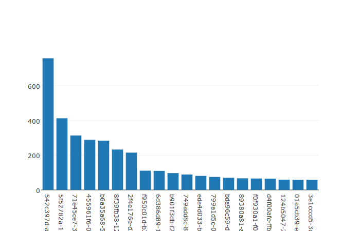
The old Top Recipients graph:
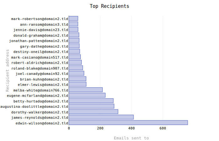
The new Top Recipients graph:
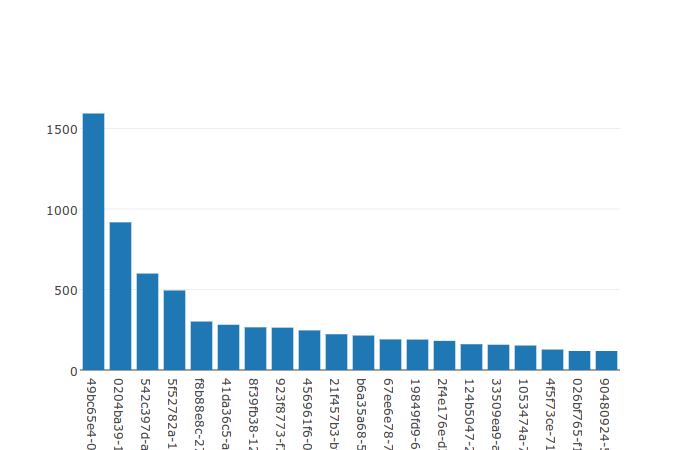
The old Top Senders graph:
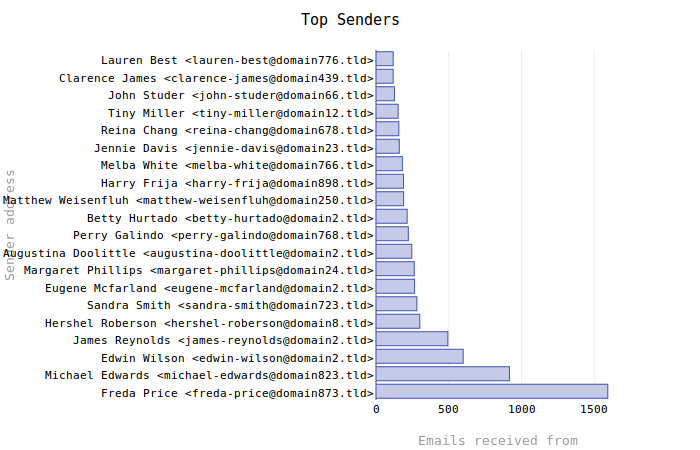
The new Top Senders graph:
Generating Random Names
Previously, a simple uuid.uuid4() was used to come up with "anonymized" names and addresses for every email address encountered. While effective enough, this created very long (36 characters) strings that made even longer complete email addresses. Take this address for example:
"f47ac10b-58cc-4372-a567-0e02b2c3d479" <f47ac10b-58cc-4372-a567-0e02b2c3d479@domain.tld>
That is 87 total characters and, while the uniformity is nice, looking at hundreds of those one after another became very daunting. Plus, these long addresses were using up precious space on graphs! With little effort I managed to find the very simple names package. What does it do? It generates random names. That's it.
So I replaced the old _anonymize_address() method with one similar to the following:
0 1 2 3 4 5 6 7 8 9 | import names def anonymize_address(address, name): domain = 'domain1.tld' anon_name = names.get_full_name() return { 'address': address, 'anon_address': anon_name.replace(' ', '-').lower() + '@' + domain, 'name': name, 'anon_name': anon_name } |
Very simply, this function makes up a fake domain, gets a random full name from names and then creates an email address and a name to associate with the provided address and name parameters. The actual method also keeps track of these domains and addresses while parsing the data.
What does all this mean? Instead of getting 87 character random addresses like these:
"f47ac10b-58cc-4372-a567-0e02b2c3d479" <f47ac10b-58cc-4372-a567-0e02b2c3d479@domain.tld>
"b2d351b3-4607-48e4-9e17-e8d7266438af" <b2d351b3-4607-48e4-9e17-e8d7266438af@domain.tld>
"8e35be14-f719-416b-bc16-a31e260f4385" <8e35be14-f719-416b-bc16-a31e260f4385@domain.tld>
"79417a64-dd09-400c-93ec-58cbef0d1e01" <79417a64-dd09-400c-93ec-58cbef0d1e01@domain.tld>
"f38e5aac-3211-45b3-bc24-80b3754ae32c" <f38e5aac-3211-45b3-bc24-80b3754ae32c@domain.tld>
We get addresses like these:
"Stevie Fulton" <stevie-fulton@domain1.tld>
"Anthony Scott" <anthony-scott@domain1.tld>
"Tony Pack" <tony-pack@domain1.tld>
"Charlotte Wilson" <charlotte-wilson@domain1.tld>
"Hugh Jackson" <hugh-jackson@domain1.tld>
The longest address in that group is 49 characters, almost half the uuid4-based addresses. Granted, this is random so we may get something 87 characters or even longer, but the non-uniformity has one other big advantage: referencing. If I want to produce and talk about some graph based on email addresses, it will be much easier refer to a name like "Stevie Fulton" than "f47ac10b-58cc-4372-a567-0e02b2c3d479".